
I was working on a Custom Page, which needs to show custom icons in low-code but also inside a complex PCF on the same page. I’ve found very valuable blogs in the community, and added a few small experiments on top. This is more a note to myself, but maybe it’ll be useful for somebody else.
Custom SVG Icons in Custom Pages (& Canvas Apps)
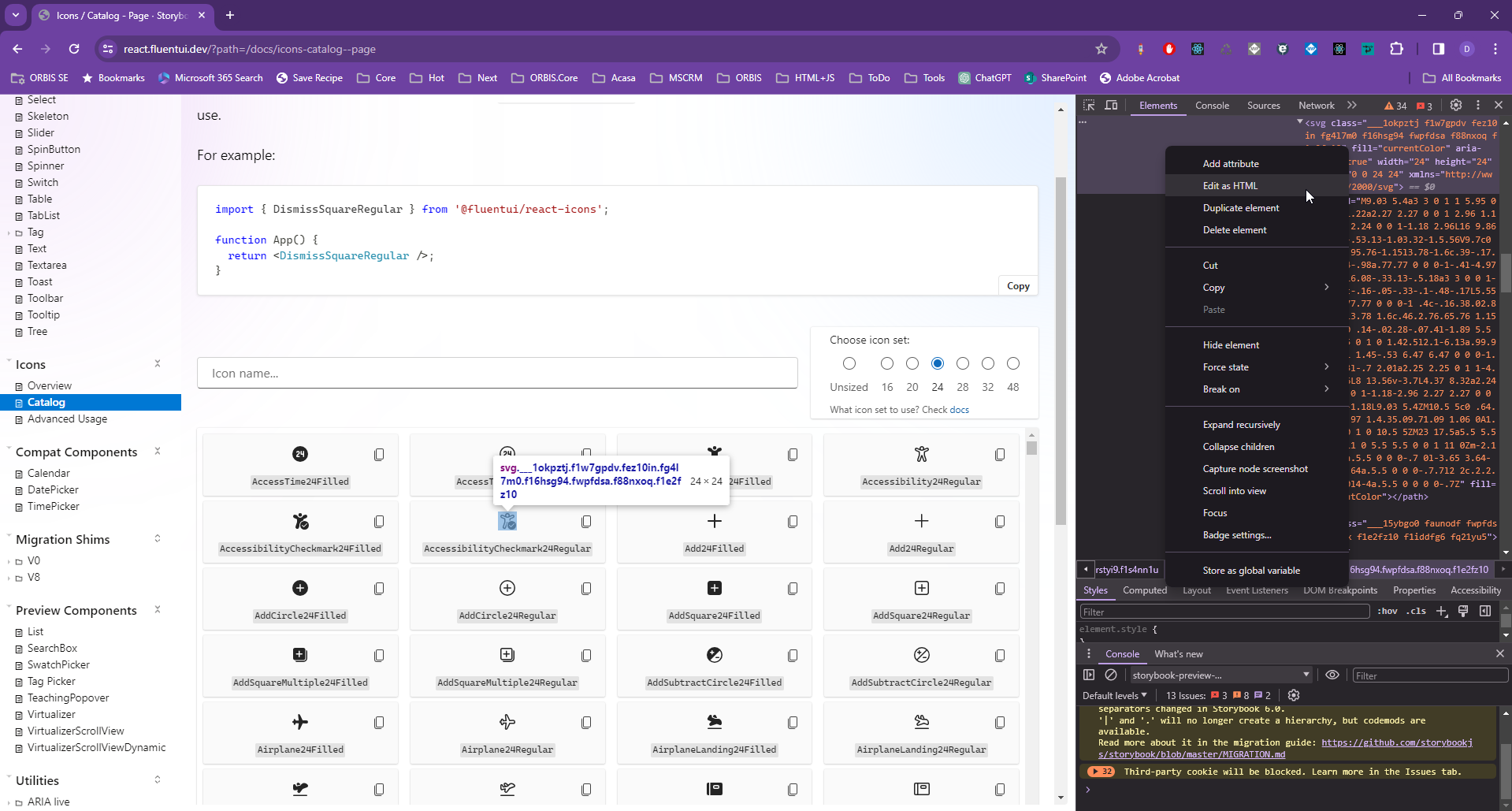
First of all, I need an SVG. I’ve decided to pick one from the Fluent UI 9 (without including the library). To pick one svg from there, I went to the Fluent UI 9 Icons Catalog, picked the AccessibilityCheckmark24Regular, opened the Developer Tools (F12), and located the SVG definition. Using “right click” -> “Edit as HTML” we can copy the complete “svg” node. (But of course you can use the svg library you want)
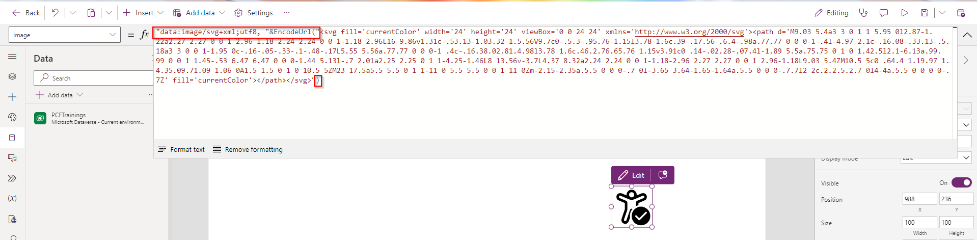
In the Custom Page I can add an image control, and set the Image property to
"data:image/svg+xml;utf8, " & EncodeUrl( "<svg ..your svg comes here by replacing the double quotes with quotes>")
I can change the color by defining the “fill” inside the svg node (remove any other fill properties, beside yours)
<svg fill='red' width='24' height='24' viewBox='0 0 24 24' xmlns='http://www.w3.org/2000/svg'>
We can also define the background by adding a style property to my “svg node”
<svg fill='red' style='background-color: pink' width='24' height='24'
This and some other great details can be found also in the blog “SVG Images in Power Apps” by Matthew Devaney.
Define the colors from the modern theming
In my Custom Page I’m using the modern Theming
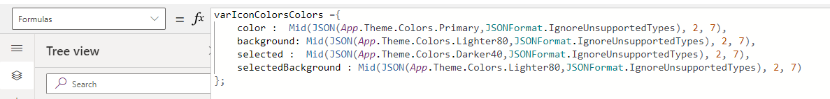
And I want to use the colors from there. But to inject the colors in the svg I need the colors as strings. I’ve learned from Luise Freese , that we can use the JSON function to get it. Let’s get one of the Theming colors, and see how what JSON is making out of it:
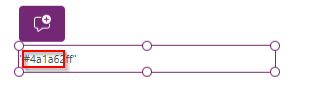
JSON(App.Theme.Colors.Darker40,JSONFormat.IgnoreUnsupportedTypes)This will look like this, but we’ll need only the 7 chars starting with the second one (so #4a1a62 in my case)
Mid(JSON(App.Theme.Colors.Darker40,JSONFormat.IgnoreUnsupportedTypes), 2, 7)Now I can go to the App->Formulas and prepare the colors
… and use them set the fill color for the SVG definition
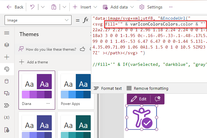
<svg fill='" & varIconColorsColors.color & "' style='background-color:" & varIconColorsColors.background & "'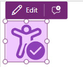
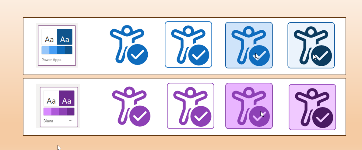
Now I want to have a different color when selected, so I’m using a variable varSelected, and the OnSelect event
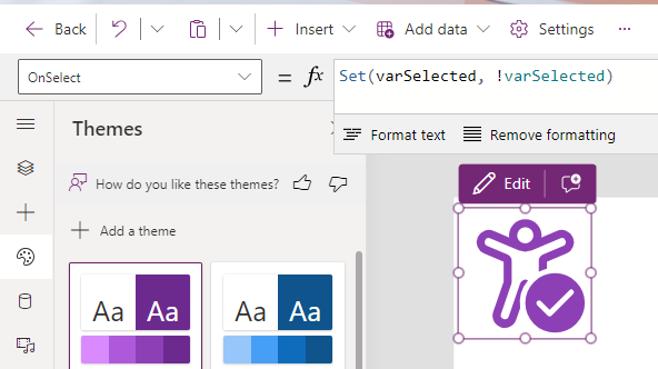
Now I can set the fill and background-color dynamically
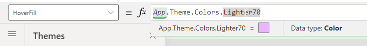
<svg style='background-color:" & If(varSelected, varIconColorsColors.selectedBackground,"transparent") & "' <br>fill='" & If(varSelected,varIconColorsColors.selected, varIconColorsColors.color) <br>& "'I’ve also added the HoverFill color for the image:
And the result: with and without border:


And of course it works also if I change the theme

Limitations
A standard icon from Power Apps doesn’t change the background-color on hover; only the fill color changes. This functionality can’t be implemented in low-code. If we really need that, we could use the PCF solution. In my case, I didn’t do the PCF only because of that, but I need to use the some icons inside a dataset PCF, so I’ve experimented how to get that.
Using the SVG in a PCF
Inside the PCF we can load some images, but unfortunately the method to load the image in code context.resources.getResource is available only in model-driven apps. Also, if we want some dynamic images, which might change in time, would be better to be able to pass images to the PCF (through the PCF parameters).
I’ve created a small PCF for showing the SVG images, where I’ve defined 3 properties: the image, the hover color and the color (for the colors I could have also used a fixed one from the theme colors provided to the PCF through the context):
<property name="image" of-type="SingleLine.Text" usage="input"/>
<property name="hoverColor" of-type="SingleLine.Text" usage="input" />
<property name="color" of-type="SingleLine.Text" usage="input" required="true" />
I’m not using react here; pretty plain but easy enough. In init function:
public init(....)
{
 this.svg = document.createElement("div");
container.appendChild(this.svg);
}
And in updateView
this.svg.innerHTML = context.parameters.image.raw;
this.svg.style.setProperty("--svg-fill-hover", context.parameters.hoverColor.raw ?? "red");
this.svg.style.setProperty("--svg-fill", context.parameters.color.raw ?? "blue");
I’m not using an image here, because I want to be able to change the colors at runtime directly inside the SVG. And for that I’m using CSS variables (–svg-fill-hover and –svg-fill) . My css file looks like this:
.Dianamics\.FancyImage div:hover{
    fill: var(--svg-fill-hover);
}

.Dianamics\.FancyImage div{
    fill: var(--svg-fill);
}
The complete PCF can be found here.
How to use this PCF in the Custom Page?
The PCF gets the “Image” parameter without any colors. The colors are provided through the other 2 parameters, and are applied inside the PCF
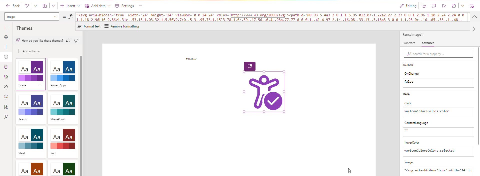
Here the Image property, for a better view
"<svg aria-hidden='true' width='24' height='24' viewBox='0 0 24 24' xmlns='http://www.w3.org/2000/svg'><path d='M9.03 5.4a3 3 0 1 1 5.95 0l2.87-1.22a2.27 2.27 0 0 1 2.96 1.18 2.24 2.24 0 0 1-1.18 2.96L16 9.86v1.31c-.53.13-1.03.32-1.5.56V9.7c0-.5.3-.95.76-1.15l3.78-1.6c.39-.17.56-.6.4-.98a.77.77 0 0 0-1-.4l-4.97 2.1c-.16.08-.33.13-.5.18a3 3 0 0 1-1.95 0c-.16-.05-.33-.1-.48-.17L5.55 5.56a.77.77 0 0 0-1 .4c-.16.38.02.81.4.98l3.78 1.6c.46.2.76.65.76 1.15v3.91c0 .14-.02.28-.07.4l-1.89 5.5a.75.75 0 1 0 1.42.5l2.1-6.13a.99.99 0 0 1 1.45-.53 6.47 6.47 0 0 0-1.44 5.13l-.7 2.01a2.25 2.25 0 1 1-4.25-1.46L8 13.56v-3.7L4.37 8.32a2.24 2.24 0 0 1-1.18-2.96 2.27 2.27 0 0 1 2.96-1.18L9.03 5.4ZM10.5 5c0 .64.4 1.19.97 1.4.35.09.71.09 1.06 0A1.5 1.5 0 1 0 10.5 5ZM23 17.5a5.5 5.5 0 1 1-11 0 5.5 5.5 0 0 1 11 0Zm-2.15-2.35a.5.5 0 0 0-.7 0l-3.65 3.64-1.65-1.64a.5.5 0 0 0-.7.7l2 2c.2.2.5.2.7 0l4-4a.5.5 0 0 0 0-.7Z' ></path></svg> "Now I have a custom icon which works like the standard ones. If I want the “selected color” and the backgroundColor on hover, I need to implement them in the PCF too,

Conclusion
Now I can define the icons in one place: inline inside my Custom Page; and can use them both for images and PCFs inside the same Custom Page.
 Dianamics PCF Lady