I love 🌈colorful apps! To create beautiful apps, also the self created code components must align to the app theming. Recently the docs got extended with explanations on how to use theming , and we’ve got an example ho wto use it Modern theming API.
It is a preview feature, but I had to try it out, and I’ve chosen to apply the theming to my ToDo dataset example, which is based on Fluent UI v9. In the docs (links above) there are also explanations on how to convert the theme and use it with Fluent UI v8, but this is not the subject of this blog.

Theming in Canvas Apps/ Custom Pages
If you are aware of theming possibilities in Power Apps (Canvas Apps and Model-Driven App) you can skip until the fun part: about applying theming to PCFs.
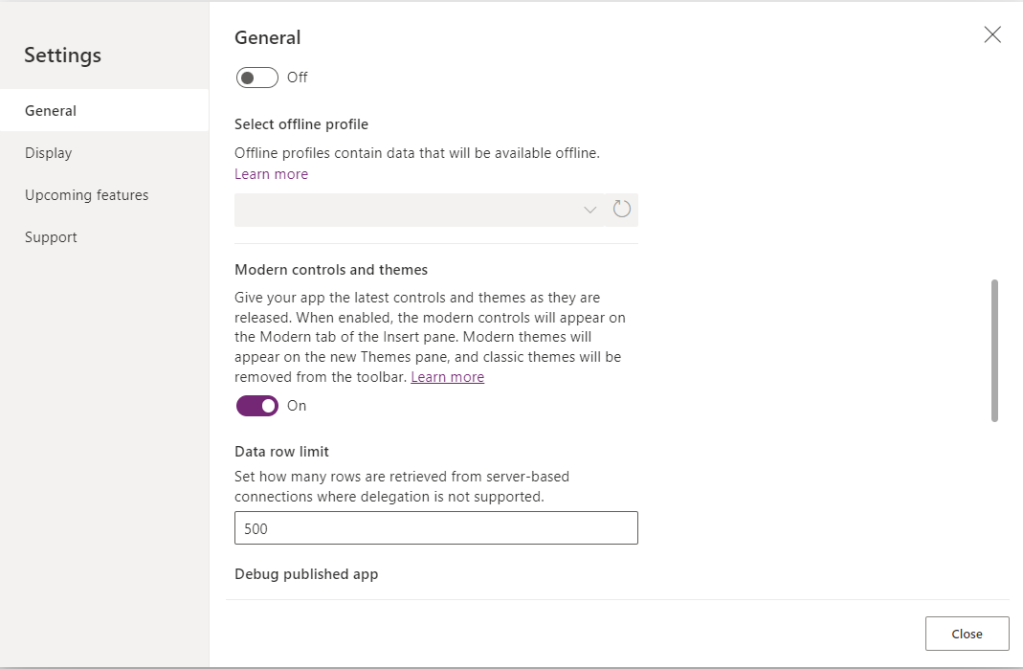
In Canvas Apps and Custom Pages we can enable the Modern Controls in App (or Page) settings.

That will allow us to use the modern controls on which we can apply one of the available themes. The modern controls are based on Fluent 2 design system.
Reza Dorrani made a post, where we can see even more themes (also SharePoint and Teams themes) (source):

You can find here more details about the modern controls and theming on Canvas Apps (and Custom Pages)
Theming in Model-Driven Apps
For model-driven apps there are two ways to apply theming.
For classic controls in model-driven apps, we had since quite a while theming customization (classic).

When we switch to “new look”, there is a new theming available. The modern theming for model-driven apps is based on a XML WebResource which we can upload and apply as a setting for your app. Unfortunately for now only the App Header theming can be defined. You can find more details about modern themes here

Apply theming to PCFs using Fluent UI React v9 (Fluent 2)
Using theming in PCFs is very easy. We get the current theming by simply reading it from the PCF context.fluentDesignLanguage:
const myTheme = context.fluentDesignLanguage.tokenTheme;
To use it with Fluent UI v9 components, we just wrap the component inside a “FluentProvider”. For instance, to apply the Theming to a DataGrid from Fluent UI React v9, we just need:
<FluentProvider theme={myTheme}>
   <DataGrid >
    //......
   </DataGrid>
</FluentProvider>
And here is the result in a Canvas App/Custom Page:


And this is my ToDo PCF on a Model-Driven form (since with modern controls we can define only the App Header, the theming provided is the same with the standard controls):
Define your own theme
Let’s have a look how this context.fluentDesignLangauge is looking like.

We are using the “tokenTheme” which is of type “Theme”
import {
  Theme ,
} from "@fluentui/react-components";
But we see there also the “brand”, which is a list of 16 colors. And that’s because of the way the Fluent UI React v9 (Fluent 2) works. Have a look to the Theme Designer for Fluent UI v9. You pick one color, and the Theme Designer is defining a palette of 16 colors

When we click on “Export”, we get all 16 colors (BrandVariants), together with some other styles for light or dark mode


We can even preview the chosen theme in light and dark mode, using the CodeSandbox link

Generating a theme by using the BrandVariants
I’ve picked a color, and took the BrandVariants generated with the Theme Designer

const myNewTheme: BrandVariants = {
  10: "#040204",
  20: "#1C141F",
  30: "#2F1F35",
  40: "#3F2848",
  50: "#50315C",
  60: "#613A70",
  70: "#724385",
  80: "#854D9B",
  90: "#9757B1",
  100: "#A467BC",
  110: "#AF78C4",
  120: "#BA89CC",
  130: "#C59BD4",
  140: "#D0ACDC",
  150: "#DABEE4",
  160: "#E5D0EB"
};
Using this palette, we can generate a theme with the function “createLightTheme”

import {
  Theme ,
  createLightTheme,
  createDarkTheme,
  BrandVariants
} from "@fluentui/react-components";
And the theme generated that way, can be used for the FluentProvider, just like I did with the theme provided from the context. Now I have a ToDo on a purple theme:

You can find here more details about customizing themes based on a Brand ramp here
Generating the Brand ramp, based on a “base palette color”
So we can generate the theme based on these color palette…but it’s a little hard to make the PCF customizbar using this Brand ramp. One way would be to define another dataset parameter for my PCF, and provide the colors using a Collection in PowerFX. But that doesn’t work in model-driven apps. Besides that, is not really nice. My target would be to be able to define a “Base palette color”, like the other “Modern controls” in Canvas Apps.

The inspiration for this I’ve found in the CodeSandbox. The base idea is to use an npm library “tinycolor2”: https://www.npmjs.com/package/tinycolor2. This is a small, fast library for color manipulation. Using it, we can lighten or darken the color. This way we can generate the 16 colors for brand ramp. You cand find my implementation for generateBrandVariants here. I’m not sure which step to use for lightning/darkning , but I find my theme pretty close to what I wanted.
So my theme is generated now using
createLightTheme(generateBrandVariants(basePaletteColor))
In my Custom Page I can have now two several themes: the app theme (ToDo PCF on the left side) and a custom color (the green one – on the right).

And now we can use custom themes in model-driven forms too, by defining the base color.

Generating brand ramp for dark mode
Right now we don’t have dark mode for apps, but I suppose we’ll get that in the future. For that I’ve created another parameter for my PCF “isLightTheme”. When I set it to false, I’ll generate the the theme using
createDarkTheme(generateBrandVariants(basePaletteColor))
Putting it all together would be
  const [myTheme, setTheme] = React.useState(theme);
  React.useEffect(() => {
    setTheme(basePaletteColor!=null && basePaletteColor.length > 0 ?
        isLightTheme ?
            createLightTheme(generateBrandVariants(basePaletteColor))
          : createDarkTheme(generateBrandVariants(basePaletteColor))
       : theme);
  }, [basePaletteColor, isLightTheme]);
In the future, I guess we can use the context.fluentDesignLanguage.isDarkTheme to detect if the app is in dark mode (the isDarkTheme we saw using the developer tools above )

The complete code for this blog can be found in my github project: ToDosDataGridFluent9
Conclusion
Out of the box, the platform provides now a theme for PCF. We just have to use it.
We can use the theme designer for Fluent UI React v9 to generate a custom theme. Or we can even generate a theme using a base color. My way of generation might be not perfect but I think it works pretty good already… and I’m sure there is more to discover on this subject. Looking forward for beautiful and 🌈 colorful apps.
Blog image was generated using Microsoft Designer


